magnum p.i. font set : Serpentine

For all non-episode specific topics about the show, including MPI-related "tie-ins"

Moderator: Styles Bitchley

Post Reply
Message
Author
User avatar
nha trang
Vice Admiral
Posts: 147
Joined: Thu Dec 16, 2010 4:07 am

magnum p.i. font set : Serpentine

#1 Post by nha trang »

Anyone ever notice how much that little yellow font set the mood for the show at the start of the episodes? Well, I did and I did a little digging and found a few links I'd like you to read :magnum:

http://www.artofthetitle.com/title/magnum-pi/
Image
Image

Commercially available Serpentine fonts
https://www.linotype.com/184528/serpentine-family.html
Image

Serpentine font, designed in 1972 by Dick Jensen for the Visual Graphics Corporation.

Now, you know what im thinking, and you're right-- would anyone be able to direct me to a serpentine font set that actually matches what they used in the show? You see, the second link i posted doesnt look quite right does it? If you look at this Serpentine font package when you look closely at say the "m" and compare to the tv font the digital fonts dont look right--the digital m looks like two backwards "r"'s rri kind of ... The tv font doesnt show it...and i can tell the tv font is shadowed but i still dont see the rr effect on the tv font.

Any fellow mpi sleuths up for some recon? I hear there are catalogues out there?

I assume, being that Magnum premiered in the 80's, that the phototypography would have been at least CRT based

Image
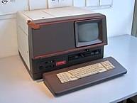
(By Marcin Wichary from San Francisco, U.S.A. - Linotype CRTronic 360, pt. 1, CC BY 2.0, https://commons.wikimedia.org/w/index.php?curid=3863709)

and not this behemoth: The Visual Graphics Corporation PhotoTypositor The Visual Graphics Corporation PhotoTypositor Image

(incidentally I did see a post where someone had one of these in a basement they were willing to give away, but my wife would kill me)

Man would i like to get my hands on the original jensen typeface and or a hopefully crt typesetter --whatever they used on mpi
Does anyone here know anyone who was involved on this part of the show production? Or can anyone find a publication with the original Serpentine oblique font type by Dick Jensen of Visual Graphics Corp, or can we confirm that someone in production made a slight tweak to the original font, creating a very unique type all its own?

I found a single solitary VGC alphabet catalog from 1976 on Amazon and emailed the seller and he said there were only a few lines in the 364 page book on Serpentine and evidently not the "obique" type. If we can locate a simple scan from one of these VGC catalogs we will know for sure, and can possibly recreate the font. I bet there is someone out there who was involved with this who can solve the mystery for us. At any rate, we need a fan made font that is exact, I know what you're thinking, and you're right -- I'm OCD lol.

Looking closely at the Magnum Mania logo, it seems to me that JJ wasn't happy with the stock Serpentine fonts available on line either, since I don't see the trademark errors I mentioned in the paragraph earlier.

I hope you Magnum p.i. purists like me enjoy this post, and I look forward to your feedback.

nha trang

User avatar
nha trang
Vice Admiral
Posts: 147
Joined: Thu Dec 16, 2010 4:07 am

Re: magnum p.i. font set : Serpentine

#2 Post by nha trang »

I found a lot of information on this site about fonts and Dick Jensen's Serpentine (as well as several digital type faces based on it).

I believe that it shows the actual Jensen typeface here:

Image


So, it seems the Magnum p.i. production must have modified the Serpentine font, probably using the phototypositor, or we have a different font altogether. Note: also look at the lowercase "g" in Magnum compared with the Jensen g.

I wonder why they would have gone through all of that trouble and how they would have kept it consistent.

nha trang

User avatar
Styles Bitchley
Magnum Wristwatch Aficionado / Deputy SpamHammer
Posts: 2674
Joined: Tue Mar 24, 2009 12:15 pm
Location: Canada

Re: magnum p.i. font set : Serpentine

#3 Post by Styles Bitchley »

This is a pretty cool discussion issue. I've always liked fonts and I've never seen a discussion here about the ones used in the show. I'm not as OCD as nha trang, however, so the differences aren't as glaring when I look at them. It would certainly be interesting to find the exact ones used. They may indeed have been modified though. I remember a friend doing a graphic design course was challenged to create his own font style by the instructor, so people do this.

I think Conch works in the printing business or something like that. Maybe he as some expertise...
"How fiendishly deceptive of you Magnum. I could have sworn I was hearing the emasculation of a large rodent."

- J.Q.H.

User avatar
nha trang
Vice Admiral
Posts: 147
Joined: Thu Dec 16, 2010 4:07 am

Re: magnum p.i. font set : Serpentine

#4 Post by nha trang »

Styles, good to hear from you old chap, hope things are well.

Im still mourning the loss of pahonu, the reboot and the fact my sase package to mr selleck hasnt come back since i sent it in may!

Thank you for helping to get the conversation going, we do have a lot of expertise here on the board and i want to engage the mpi permafan community after the loss of our beloved pahonu and the passing of mr hillerman.

Edited to add, sorry styles :oops:

Happy trails sir until we meet again, im still interested in writing an existential piece on mpi but i need to rewatch the series to do it

Nha trang
Last edited by nha trang on Fri Aug 10, 2018 6:59 am, edited 1 time in total.

User avatar
Little Garwood
Fleet Admiral
Posts: 1261
Joined: Thu Apr 17, 2008 9:53 pm
Location: The Magnumverse

Re: magnum p.i. font set : Serpentine

#5 Post by Little Garwood »

Speaking of fonts, I always thought that the one used by MPI in the episode titles was identical to the one used by an earlier CBS series, Kojak. Perhaps one of the resident font specialists can confirm (or deny) this.
"Popularity is the pocket change of history."

~Tom Selleck

User avatar
nha trang
Vice Admiral
Posts: 147
Joined: Thu Dec 16, 2010 4:07 am

Re: magnum p.i. font set : Serpentine

#6 Post by nha trang »

Little Garwood wrote:Speaking of fonts, I always thought that the one used by MPI in the episode titles was identical to the one used by an earlier CBS series, Kojak. Perhaps one of the resident font specialists can confirm (or deny) this.
I don't think the KOJAK title font is the same what about you guys?

Image

But maybe KOJAK and other Universal shows share font in other areas, such as in the credits...
The font set below was created by a user on that font message board to match the generic Universal font, in this case using COLUMBO as an example. I wouldn't be surprised if this pattern fits the MPI font in the show credits.

Image
created by username andrewskyde at http://forums.stevehoffman.tv

If the above were a match for the credits, then that would leave us with the Magnum P.I. title, and the episode title. I figure there are 3 important areas of screen captures to explore, The title (as we do above) the opening and ending credits, and then of course the episode title. But not so fast, in the opening credit for Selleck the lowercase Magnum seems to be similar to the Serpentine font
Image

A member of that message board states in reference to a separate font conversation than ours
The "R" isn't the same in your last example. You probably won't find an exact match. Grab as many screen grabs as you can find of the entire alphabet from the credits, and make the font from scratch. There are free programs for making your own custom fonts
So, if there was an entire font set created for MPI that would be awesome to have, but I do think it is far more likely that they customized the font for the Magnum P.I. title, relying on far more generic (and less expensive) standard Universal fonts for the other text on screen. Clearly we are going to need some side by side screen captures...but the lowercase fonts in the Selleck credit above have me excited that there is an "entire" a-z Magnum PI font, even if it only exists for a phototypositor.

Little Garwood's hunch proved to be a good one, it led me to that font message board right away. On one hand why would Universal reinvent the wheel for MPI. I mean, in our opinion MPI is a hall-of-fame show, could it really share the same font with some other Universal gem like Airwolf? [ side note: sorry just kidding, obviously we don't have the same font as Airwolf but per wikipedia we have quite the connection with Airwolf, Bellisario created it and there is an even further MPI connection with Airwolf according to wikipedia


I hope you MPI fans are enjoying your weekend and get lured back in to the message board

To be continued.... :magnum:

User avatar
Little Garwood
Fleet Admiral
Posts: 1261
Joined: Thu Apr 17, 2008 9:53 pm
Location: The Magnumverse

Re: magnum p.i. font set : Serpentine

#7 Post by Little Garwood »

nha trang wrote:don't think the KOJAK title font is the same what about you guys?
Episode title fonts for both shows:

Kojak:

Image

Magnum:

Image
"Popularity is the pocket change of history."

~Tom Selleck

User avatar
nha trang
Vice Admiral
Posts: 147
Joined: Thu Dec 16, 2010 4:07 am

Re: magnum p.i. font set : Serpentine

#8 Post by nha trang »

Very succinct comparison garwood

Clearly you are right, so the only remaining mystery for the MPI font is the TITLE which also seems to match the lowercase font on the credits.

So, if I were in a region where MPI was still on Netlflix in HD, I guess I would be doing some Aa-Zz screen captures of those characters until a full alphabet could be completed. As it stands, I guess I'd have to try and pull screencaps off a DVD running in my laptop. I'm not sure I want to start up that nightmare with the double sided DVD discs.

I did see that MPI was available with a 7 day free trial on "STARZ" on Amazon instant video, maybe I could do that.

As per prior in the thread this is possible, potentially even with free software. So, *this* is the prize I was hoping for

hehe

:magnum:
nha trang

Post Reply